Showing posts with label beachy dresser. Show all posts

Friday, 12 August 2016

Antique cabinet


Isn't this piece cute.  We were given this by a relative who had it stored in their musty basement.  I didn't snap a before, but trust me, it was brown, boring and dingy.  I knew I needed to brighten her up.


I has a great time playing around with the colours and think it turned out beautifully.  It is certainly much nicer then where it started from.


Thursday, 7 November 2013

Weathered Teal 9-Drawer Dresser

Eeeek.  Im losing the light.  Daylight savings and the Earth's tilt are taking my good lighting away for pictures.  Its dark here now at about 5pm.  I think I snapped these pics at about 3:30 and it was already so dark that they look really grainy and my wallpaper looks pink instead of white.  So, apologies in advance for that.


I was really happy to do this piece after that crazy white mcm overhaul I did before.  This was a wonderful, textbook project.  I found this great Kroller piece which is solid wood and in fantastic condition.


 I started by sanding down the entire piece , cleaning it, and then painting on a couple of coats of teal chalkpaint.


Its been a while since I did anything whimsical, so I added some vintage wallpaper from Eaton's to the top square detailing.


I used a very light shade of blue to fill in the recessed rectangle trim to add a little bit of extra visual interest.


I gave the entire piece a super-duper heavy distressing.  I wanted this piece to look really aged and weathered.


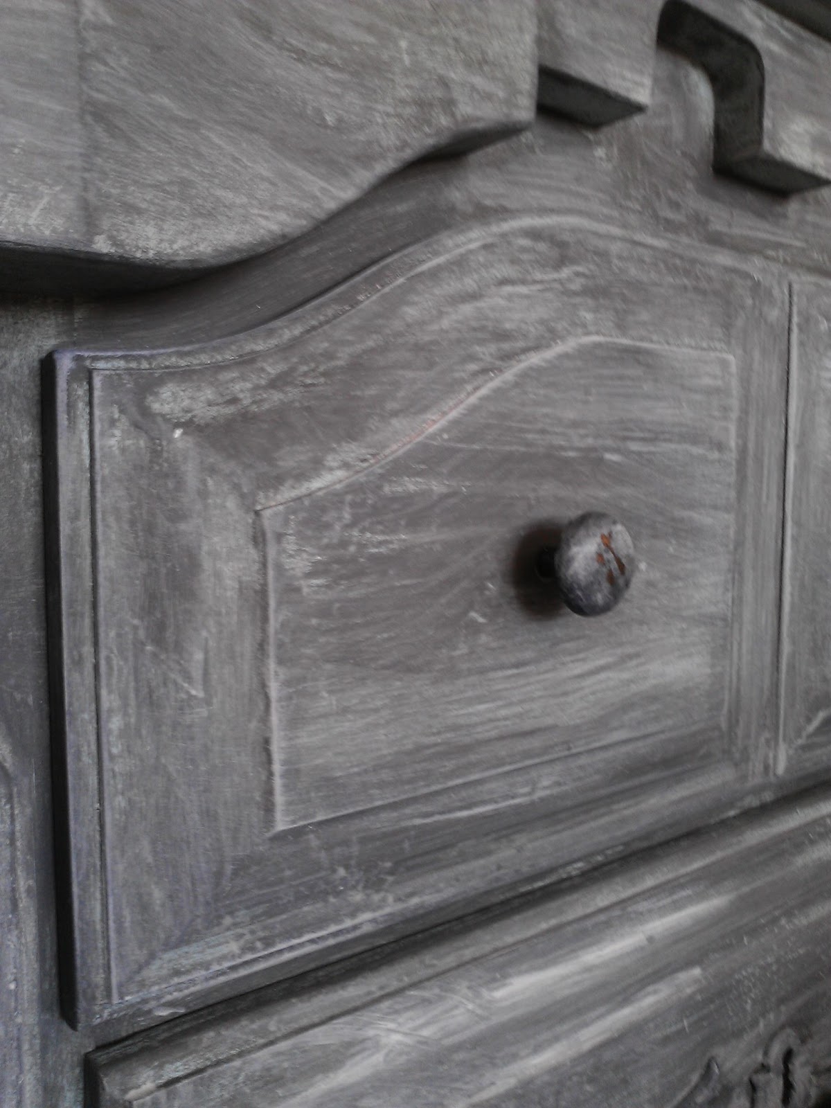
A closeup at the recessed detailing and the hardware.


FOR SALE ON MY ETSY SHOP!!


THE BEFORE

Thursday, 29 August 2013

Aged Light Turquoise

I custom mixed up this colour.  It is a nice feminine blue-turquoise.  This dresser was in fabulous vintage condition.  A great find with all the detailing.

  
I sanded really well, and then primed the entire thing with Zinsser BIN (I find this stuff so frustrating to work with because it dries so bleeping fast, but it has aaaaamazing adhesion)


After my Zinsser dried (about 4 seconds later), wink wink, I painted on two coats of the turquoise.  I then highlighted the recessed detail with cobalt blue, and the raised detail with a lighter shade of the turquoise.


The result was very pretty, but not nearly edgy enough, I decided to give everything a really good sand to make it look more ‘antique-chic’ and less ‘little girl’s room’.


Because the Zinsser is stubborn as hell, it doesn’t come away when sanded like the paint does, so its great for creating a layered paint look.


The hardware was very dull and dingy, but I used my old sanding technique to bring out the soft gold lurking beneath.  I then shot a blast of sealer to prevent future tarnishing.


I picked up four new rolls of decorative paper a couple of days ago, and it was a real toss up to decide which one to use on the inside drawer facings.  I decided to go with a grey/white chevron pattern.  I kind of think it gets a bit lost against the boldness of the dresser.  I had a great dragonfly on butcher paper one, I wish I’d gone with that one instead!  Next time.


And here is the before. Not a bad looking lady.


Linking up to missmustard seed.  Have a great long weekend!

Thursday, 8 August 2013

Big Bertha Dressed In Turquoise

I promised a ‘big bertha’, and now I present Big Bertha!  My word, this ol girl almost embarrassed herself by not fitting into my Mazda 3 hatchback.  I had to give her a subtle lecture about diet and nutrition, because she is... big and chunky!  Almost 7 feet long and definitely over 200lbs (sorry Bertha, but disclosing your weight is for your own good).  Eat some lettuce.


I clearly love this shade of turquoise/teal, because I have used it a billion times now.  I use it so much that my neighbor stopped by for a garage-chat the other day and asked ‘are you still painting that dresser?’ I paused midstroke and threw him a puzzled look before stammering, ‘No, I finished that one months ago, this is different one.’  I was too ashamed to tell him I had done about five other ones in the same colour in between the one he was referring to and this one. 


He is also the same neighbor who when I told him I rescued a beautiful credenza that was bound for the dump (this post), asked me if that was the colour I received it in (I had painted it the same shade of turquoise) implying that I hadn’t done anything to it yet!  Men.  They just don’t appreciate a nice shade of turquoise.  I did take a dose of pleasure a week later by complimenting his turquoise shorts and quipping that he matched my furniture.  He may or may not have blushed.  He may or may not have got my point. But I had a little inward swell of vindication. 


But back to Bertha!  She was in great shape for such a hefty girl.  I custom tinted some primer before covering her up in my favorite colour. 


The hardware was beautiful in it’s grandness, but it was very dull and dark, so I blasted her with some gold spray paint to really amp up the contrast with the dresser.


 I did some heavy distressing to reveal the lovely dark wood – a little peek-a-boo.  I also accented with some light blue piping and a touch of yellow to tie in with the gold.


The cupboard opens up to reveal three more drawers which I finished in a turquoise/navy chevron paper for a pop of fun.


I love big-bertha, but it will take a big room to handle a statuesque woman like her.  She is too much women for my little hallway, indeed!


Linking up to party with:

miss mustard seed


Monday, 27 May 2013

Very Whitewashed Grey Dresser

This dresser was a long and drawn out affair (think Victor and Nikky from Y&R)  I began by painting it a light blue, but the finished effect looked ill suited to anything but a nursery.  The plan was to have it in our bedroom, so nursery was definitely out of the question.


Phase two was to paint over the blue with grey.  It looked better.  A little.  But it still didn't have any pazzaz and it just didn't quite get me excited.


Phase three was to whitewash over the grey, ok I started to like it a little more, but it needed some extra contrast in my mind, bring on Phase four..


Phase four was to stain the top a very very dark chocolate (almost black) to amp up the contrast a bit.


It is a great addition to the muted tones of our bedroom and provides ample storage for Mr. Chuckles' unmentionables.


The cute vintage pictures are framed advertisements from old 1950s 'Life' magazines passed down to us from Mr. Chuckle's grandfather. I love the one of Santa holding a typewriter.


A close up of the whitewash technique.  I painted over the knobs as well, and then did some light distressing to show the brass through.  

I haven't decided if I will distress the dresser.  What do you think?