Monday, 1 February 2016

Gray and Gold

I'm loving grays with Brilliant gold at the moment.  A quick scan of painted kitchens on Pinterest will show just how popular this combination is at the moment.
 
I have painted a few gray/gold combos at the moment and just love them!
 
 
This is a solid heavy oak piece that is in great condition.  It was a bit short though, so Mr. Chuckles and I added the legs to bring it up to counter top height of 36".  I find in a larger room the added height make it feel more contemporary and the legs add an airiness.
 
 
I love the contrast the gold has with the gray.  The colour is called Raccoon Fur by Ben Moore.
 
 
I personally love being able to see heavy oak grain through the paint, it just adds one more element of interest.


And a cute pair of nightstands painted in the same colour combination.


No before pics.  Apologies!
 

Navy Blue and Bright Gold Dresser

Hi guys, its been awhile since I updated, so I thought I should get into gear and show a few of the pieces I have been working on lately!

Im still loving me some blue at this moment, and now with so many different paints and tints in my stock, I have a great time mixing up my own colours!  I was aiming for a grayish navy with this one and Im happy with how it turned out, especially with the hardware painted brilliant gold.

 
I have almost exclusively been using Zinsser BIN as my primer for the last year now.  It costs a pretty penny, and the fumes will get you high if you don't use a respirator, but it is hands down the best primer in terms of blocking stains and bleed through as well as giving amazing adhesion.  Plus it dries super quick allowing you to get a primer coat followed by a first coat of paint during a single episode of Downton Abbey.

I did my usual sanding, vacuuming, washing, wiping, drying.  Followed by a tinted coat of Zinsser and then two coats of the navy in Dulux Diamond Pearl.  I also did a topcoat of acrylic poly on the top for added durability.  Lots of work, but I don't like to skip steps as it usually results in a bad result that won't hold up.
 

Friday, 20 November 2015

Back from the dead

It felt pretty strange hitting that 'new post' button.  Wow, it has been months since I have done a posting.  I have no excuse, life has just been rolling along as per usual, I have been painting furniture, I guess I just haven't felt like blogging about it.  But I'm sitting here and have finally found the motivation to do a post...although apart from my mom - Hi Shazza - there probably aren't too many other followers left! 

First up, France was great.  The picture above is me navigating a map on the way to Mount Saint Michel.  Mr. Chuckle's and I biked our hearts out and I thoroughly enjoyed the countryside and sleeping in our little tent every night.  So simple, so serene, so peaceful.  We didn't get through as many KMs per day as we thought we would, but usually averaged about 60 which wasn't too bad given we were riding our regular mountain bikes, nothing too fancy.   It is really such a beautiful country, and Paris is a gorgeous city, its so sad to hear what is going on there at the moment.  Such a mad mad world.


I have been painting furniture since we have been back and rather then do a lot of separate postings, I am just going to post a few of my most recent pieces together to save some time.  The piece below was such a stunning and high quality piece.  It stood at 36" and was so grand (and heavy). 


This was also a gorgeous piece and super well built.  I painted it in a soft cream with a taupe overlay.  It looked so much better in real life, I just couldn't get the camera to capture the beauty.


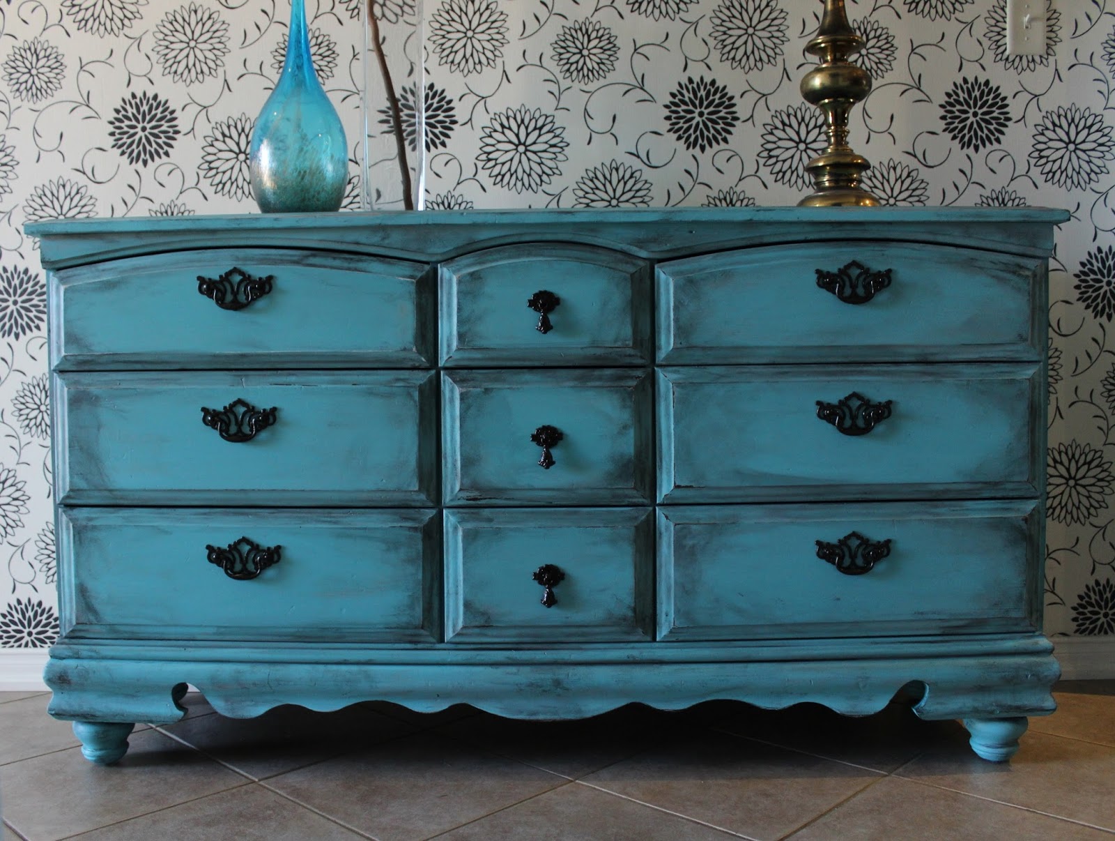
Mr. Chuckles was given this piece by his uncle.  It has great medieval strapping on the corners.  We opted for a rustic teal look.


I love this dresser.  I bought it from a couple from Cuba who were living in Toronto but were moving out east to New Brunswick the morning after I bought it.  It was so ugly in its original wood state, but that gorgeous raised detailing came out a dream in this rustic teal look.  Great oversized hardware!


When Mr. Chuckle's brought this piece home I was like 'meh'.  But I think we managed to make it look more unique by adding the bun feet and new middle section hardware.


You know I love a good two-tone MCM, this highboy was in great condition.  The drawer facings are original, I just needed to two-tone the wrap.


Ive done this combo of cobalt and gold so many times that I don't even want to post about it anymore! lol.  But I really like the legs and hardware on this one, so I thought, why not.


A couple of vintage mirrors, I painted matte black, distressed and a touch of wax for an instant update.


Another two tone, but I opted to paint the bottom drawer as well for a slightly different look.  I don't usually love hardware on two-tones, but this original hardware is pretty cute.

Tuesday, 23 June 2015

Cycling through France!

Yay, summer is finally here!  I know I have been MIA for a while, but I've got some fun news to share to explain why!  Mr. Chuckles and I have been busy planning for a trip to France in July.  And not just any trip, we are flying our bikes over with us, along with our tent, sleeping bags and camping stove and we are going to make our way around the countryside on our bikes, camping as we go.

So we have been really busy trying to get things organized and accumulate all the gear we will need.  We have tried to keep costs low, so a lot of the gear we have purchased has been second hand or from thift stores.  I did splurge a little though and buy a good quality hikers tent as well as a mini stove and good sleeping bag. I can't stand being cold at night.

 
I have managed to get a little bit of furniture done over the past few weeks though.  Rather than do a separate posts, I am just going to showcase them together here.

 
First up are these neat little bongo-style side tables.  They were not much to look at in the original state, but their bright new shade perks them up a bit!


Secondly, I used a vibrant shade of purple on this buffet.  I never use purple, but I had done a French set for a friend in this colour and really liked it, so I thought I would put it to use a second time.  It pulls a little blue in the pictures, but it is most definitely purple.

 
The oak grain is still visible through the paint, I love painting chunky oak pieces vibrant colours, they always turn out so great!


Right, I'm off to do more trip organizing, have a sunny day!