Wednesday 29 May 2013

Aqua Vintage Waterfall Dresser

I went for a very distressed, very time worn, and very rustic look for this vintage waterfall dresser.  


I used a paint layering technique featuring white, mint, teal, and aqua blue.


It isn't a look for everyone, I know.  But I can imagine it in a nursery, a romantic bedroom, or perfect for the beach side cottage.


I love the original pulls. They remind me of Angels' wings.


Union Jack: The Sequel

Round two!  My other union jack dresser was pretty rustic and vintage inspired.  I went for a different feel with this one.  I wanted it to feel a little playful, a little retro, a little 'Andy Warhol pop culture'.


I used a lighter shade of blue, almost a duck egg, but combined that with the bold red.  Instead of painting the whole body of the dresser blue, I opted for white to keep it light and fresh.
  

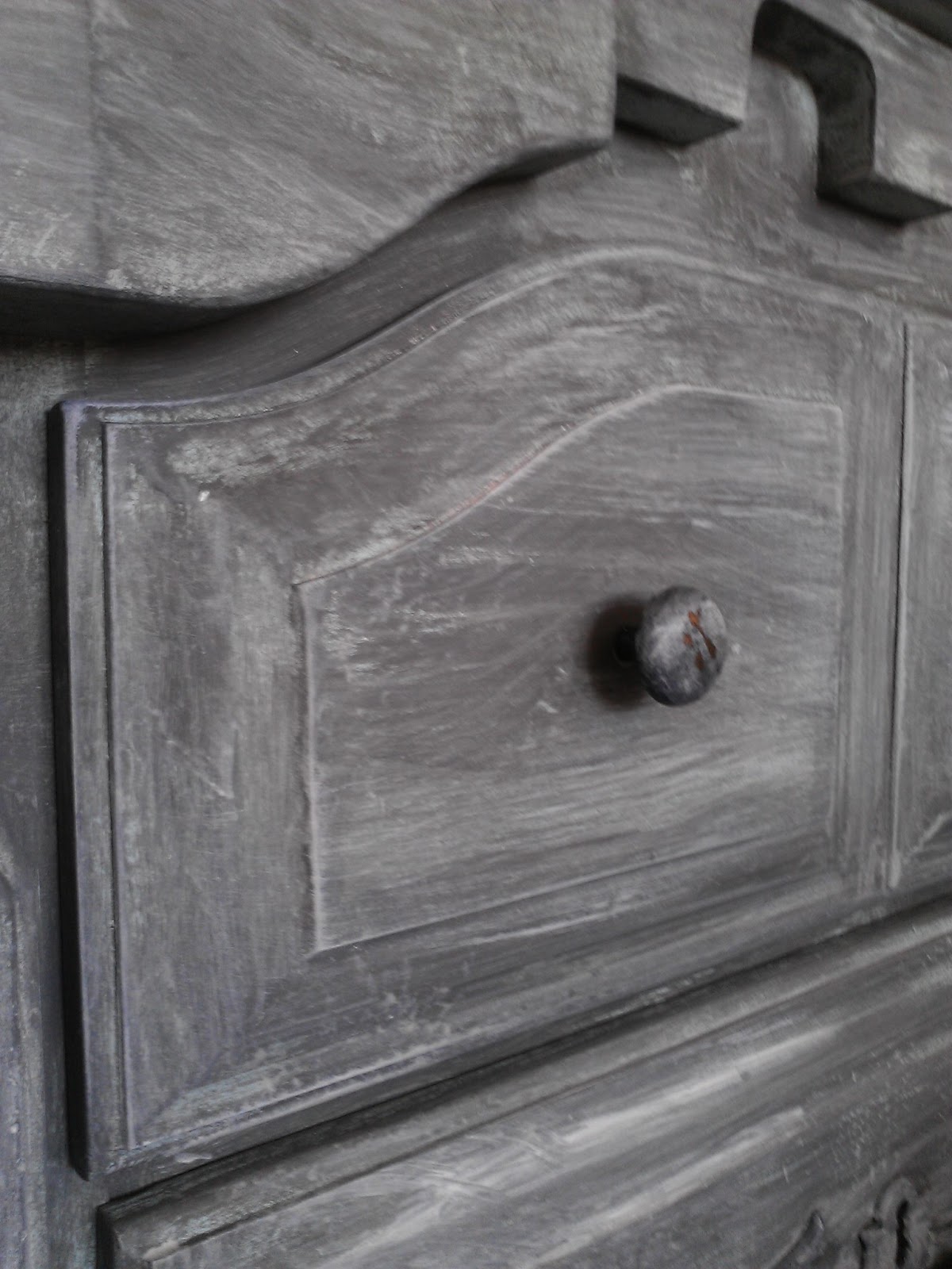
The hardware is shiny silver.  I love the retro feel the little knobs give.  


Its pretty neat how you can work one flag so many ways!  Ive seen so many cool renditions of the Union Jack in Blogland.


linking up to savvysouthernstyle

Monday 27 May 2013

Very Whitewashed Grey Dresser

This dresser was a long and drawn out affair (think Victor and Nikky from Y&R)  I began by painting it a light blue, but the finished effect looked ill suited to anything but a nursery.  The plan was to have it in our bedroom, so nursery was definitely out of the question.


Phase two was to paint over the blue with grey.  It looked better.  A little.  But it still didn't have any pazzaz and it just didn't quite get me excited.


Phase three was to whitewash over the grey, ok I started to like it a little more, but it needed some extra contrast in my mind, bring on Phase four..


Phase four was to stain the top a very very dark chocolate (almost black) to amp up the contrast a bit.


It is a great addition to the muted tones of our bedroom and provides ample storage for Mr. Chuckles' unmentionables.


The cute vintage pictures are framed advertisements from old 1950s 'Life' magazines passed down to us from Mr. Chuckle's grandfather. I love the one of Santa holding a typewriter.


A close up of the whitewash technique.  I painted over the knobs as well, and then did some light distressing to show the brass through.  

I haven't decided if I will distress the dresser.  What do you think?

Sunday 26 May 2013

Yellow and Gray Curio Vintage Cabinet

I painted this for a lovely girl who wanted to preserve the heritage of the piece, yet update it with some bright colour.  


This ornate little cupboard was a family heirloom passed down from her grandmother who received it as a wedding present many years ago.


She picked up the adorable knob at a market in NYC and thought it would look great, I think she is right.


It truly is adorable, and although it was cute before the transformation, I think it will be a show stopper now. 


I hope she likes the finished piece as much as I do.


Friday 17 May 2013

Striking Turquoise Dresser

If you have looked through my blog, then you have seen a very similar piece before, ok, maybe even two.  I just love raised detailing on dressers, it adds such interest, especially once it is painted out.


I have a lot of natural light on this dresser, so it looks 'I need sunglasses' bright.  In reality it is quite a deep shade of turquoise, mostly blue, but with a subtle shade of green as well.


I left some of the wood to poke through on the detailing to add some depth.  I also did a bit of accenting with white and yellow.


The hardware was in really bad shape, I thought I was going to have to spray paint it, I started to give it a light sand so the paint would have something to grab onto, when I noticed it started to sparkle underneath.  It was quite magical, I just lightly sanded and in the process polished up the hardware.  This pic below shows the after and the before.


Monday 13 May 2013

Kitchen Island IKEA Hack

When I asked Mr. Chuckles if he thought our IKEA kitchen butcher block was too small, he gave his head a little scratch and asked me if we might be able to give it a 'remodel'.   An afternoon later we had come up with this.  We used old metal drywall studs and some wood planks to basically extend the island to twice its regular size.

 
Our kitchen has a lot of stainless steel in it which is why we decided to incorporate the metal studs into the project.  Let's keep things shiney.

 
We still use the original chopping block topper, as the wood planks we used to form the top of the piece are varathaned, and not particularly good for chopping on.  We inherited these old stools from Mr. Chuckles grandma, and think they compliment the piece nicely and add a pop of colour.

Sunday 12 May 2013

ASCP Florence and Mint French Dresser


I was originally going to go for a charcoal and white combination for this french dresser, but I am really feeling colour at the moment and so I decided to go with this emerald/mint combination.  The body is Annie Sloan Florence and the drawer fronts are a custom mix. 


I did some light distressing to age the piece.  I also painted some white underneath the mint colour on the drawers to provide a romantic layered look to the finish.


I gave the original pulls a small blast of gold spray paint because I love the way emerald and gold go together.


This colour scheme gave me the perfect excuse to use this vintage wallpaper I found at an op-shop.  It was from Eaton's and the original sticker price was $2.99 for the roll.  Bargain.


 I usually wax the top of my pieces, but I decided to try a poly this time.   I sanded back and then put a coat of wax on top of the poly.  The result is a soft sheen, and is very durable!


Here is a before shot


Friday 10 May 2013

Grey Midcentury Modern Buffet

Midcentury pieces are getting harder to find due to their increasing popularity.  When I came by this one I tossed around several different ideas for refinishing it. I gradually settled on the idea below in my head.


I liked the idea of restaining the top because it was in such good condition, and I thought I would try a gray/yellow combination seeings its so trendy at the moment.


I modpodged this leafy grey and white paper onto the hidden drawer as well as lined the drawer with some gray and yellow fabric I had.

I used a flat paint for this; 'diamond' by Dulux in a deep charcoal colour.  I finished with clear wax and buffed, but the sheen did not come up the way it does with chalk paint, so the piece is still very flat.

Midcentury Modern Rich Blue Sidetables

I spotted these little beauties in a second hand store.  I have been wanting to refinish tables like this for a while, and opportunity finally knocked.  I was originally going to paint them bright red, but changed my mind at the last minute in the spray paint isle.


I opted for a spray paint finish which is something I dont do often.  I primed with Krylon Grey and used Krylon blue in a gloss finish as a topcoat.


The initial finish was a little streaky, so I cut it down using a blue glaze and then finished with a gloss poly. The finish is now very even.


Im very happy with how they turned out and love the bold colour.


Here is a before pic.