Showing posts with label distressed. Show all posts

Tuesday, 13 May 2014

Weathered Armoire with Vintage Paper

Hi everyone, here is my latest piece!  NOW. Before I go into details I first want to say that this is the first piece that I took pictures of against my new 'staging wall' which is in the garage.  I love taking pictures against my black and white floral wallpaper, but Mr Chuckle's and I were getting a bit weary of brining every single piece into the house to take pictures of..So, I thought I would try something new.
 
 
I am not particularly happy with the outcome of these pictures.  I tried a couple of different approaches to how much light I was letting in, but it still isn't an ideal result.  I will have to keep playing and trying to tweak a bit with future pieces.  So I apologize for the less than amazing pictures (not that my previous pictures were that much better! - they just had a prettier backdrop).
 
 
I don't usually work on armoires because they are not my favorite style of furniture, but I came across this piece as part of a matching set with the piece I finished in navy and gold (here) and figured I may as well take on both.
 
 
I knew I wanted to do something using my vintage Eaton's wallpaper which I have used on the inside of a few pieces, but I haven't really used on the outside of one yet.  I just love this paper - both the colours and the design are beautiful.   It is a pre-pasted wallpaper (yay!) so it was so easy to apply.
 
 
I custom mixed up a blueish green to match one of the colours in the wallpaper.  In the jar it looked more greenish, but surprisingly it came out a little more blue on the piece.  I know this because my good ol' neighbor caught sight of it and said ' now you can't tell me that one isn't blue!'.  If you have read this blog for a while, than you have met this neighbor before with some of the funny blunder comments he has made (I still like him despite this).
 
 
I knew I wanted rustic with heavy distressing on this piece because I haven't done a piece like this in a while and felt like getting a bit whimsical.  I have done a similar piece (here) many months ago, but I was ready for another turn.
 
 
I distressed heavily and wonderfully the wood grain poking through has a great 'orange' colour to it which ties in perfectly with the orange on the paper.  I also highlighted with light blue, mint, white and yellow.  A whole wash of colours mix up to make this piece special.
 
 
I wanted some extra height, so I added the legs - not the most traditional on an armoire like this, but they are removable, so if they aren't to everyone's taste, they are easily removed.
 
 
I used chalkpaint on this piece, and I sealed with polyurethane as I have been doing a lot lately.  The original hardware was spruced up with a dab of rub n buff!
 
 
I did a lot of heavy distressing, as well as some whitewashing on the side.
 
 
 Here is a close up of the great paper!

 
And the before!


Thursday, 7 November 2013

Weathered Teal 9-Drawer Dresser

Eeeek.  Im losing the light.  Daylight savings and the Earth's tilt are taking my good lighting away for pictures.  Its dark here now at about 5pm.  I think I snapped these pics at about 3:30 and it was already so dark that they look really grainy and my wallpaper looks pink instead of white.  So, apologies in advance for that.


I was really happy to do this piece after that crazy white mcm overhaul I did before.  This was a wonderful, textbook project.  I found this great Kroller piece which is solid wood and in fantastic condition.


 I started by sanding down the entire piece , cleaning it, and then painting on a couple of coats of teal chalkpaint.


Its been a while since I did anything whimsical, so I added some vintage wallpaper from Eaton's to the top square detailing.


I used a very light shade of blue to fill in the recessed rectangle trim to add a little bit of extra visual interest.


I gave the entire piece a super-duper heavy distressing.  I wanted this piece to look really aged and weathered.


A closeup at the recessed detailing and the hardware.


FOR SALE ON MY ETSY SHOP!!


THE BEFORE

Monday, 7 October 2013

A Tall Frenchman in Green

This dapper dresser was in dire need of some love when I picked him up. 


He belonged to a young girl who had a fascination with graffiti, named Brittany.  I know this, because she practiced those graffiti skills all over this poor dresser. My powers of deduction tell me Brittany liked The Back Street Boys, was in love with a boy named Brandon, and the stickers plastered all over the side indicate she enjoyed the Teenage Mutant Ninja Turtles.


 Needless to say, a lot of prep work was involved in making a blank canvas and undoing some of Brittany’s, (ahem), art skills. 


 I had mentioned in my previous post that I wanted to paint in green.  I custom mixed up this colour and admit that I tweaked it a bit with each additional coat to get a shade I was happy with. It was a bit of an evolving process to get the tone just right (not too bright, not too rustic) It reminds me a little bit of ASCP 'Florence'.

I topped with a touch of black glaze and did a light distressing because I felt it needed to be ‘aged’ up just a touch.


Here is a glimpse of just some of the creative flair young Brittany possessed.


Sunday, 26 May 2013

Yellow and Gray Curio Vintage Cabinet

I painted this for a lovely girl who wanted to preserve the heritage of the piece, yet update it with some bright colour.  


This ornate little cupboard was a family heirloom passed down from her grandmother who received it as a wedding present many years ago.


She picked up the adorable knob at a market in NYC and thought it would look great, I think she is right.


It truly is adorable, and although it was cute before the transformation, I think it will be a show stopper now. 


I hope she likes the finished piece as much as I do.


Thursday, 9 May 2013

Turquoise End Tables

Ah Turquoise.  My favorite colour.  Sigh.  I was lucky enough to find these guys a couple of days after I found their big sister (see my earlier post).  I finished them in my favorite colour :) and distressed and let some of the wood poke through.


I made a custom chalk paint for these, and finished with clear wax.  It buffed to such a lovely sheen.


Monday, 6 May 2013

Traditional Union Jack

For this Union Jack dresser, I decided to go for a traditional colour scheme, opting for a darker blue.  I began by painting the entire body of the dresser white.  Then I taped off the blue and red sections.


I painted the top the same blue as the front, and then I washed a dark glaze over it to further age it.  I used custom chalk paint for this.  Actually a combo - ASCP in Pure White, and Reetiqued chalk paint in dark blue and deep red.  :)   I used the grout recipe.

UPDATE: I have since bought a big box of DAP plaster of paris and I can say hands down that it gives a smoother finish than my grout did.


I used regular painters tape for my lines.  Taping the dresser out definitely takes the loooongest amount of time.  Fortunately I was painting in my kitchen (Mr. Chuckles LOVES when I do that!)  so my pal, the tv, was able to keep me amused during the dry times. 

I did get some bleedthrough, but I use little sharp edged artists brushes to tidy everything up.


I decided to keep the hardware, as it was so aged and burnished that it gave the piece a really rustic vibe which I think suits these dressers. Im not sure I could have cleaned it up even if I wanted to!


Overall I'm pretty happy with it! And so is the 12 year old One Direction fan who's room in now resides in.  Just below their hearthrobby poster!

Friday, 3 May 2013

Ariel the Mermaid

I love chunky bold colours and use a lot of teal, turquoise and shades of blue and green in my work. 


 I found this dresser and absolutely loved it, I used a custom mix of green and white to get the colour(s) desired. For the casing, I used ASCP in Florence, and for the drawer facings, I mixed some pure white into the mix to make it a bit lighter.  


Discovering it was too low the ground to be functional, I had Mr. Chuckles help me put these ornate and very delicate gold feet to add some height.  I love the result!   I call her Ariel the Mermaid because she reminds me of the deep sea.


I highlighted the facing trim with cobalt blue, some white and a bit of black as well.  It created a beautiful, time worn patina.


I love the contrast of that big sturdy dresser being held up by those delicate little feet.


Diamonds are a girl's best friend

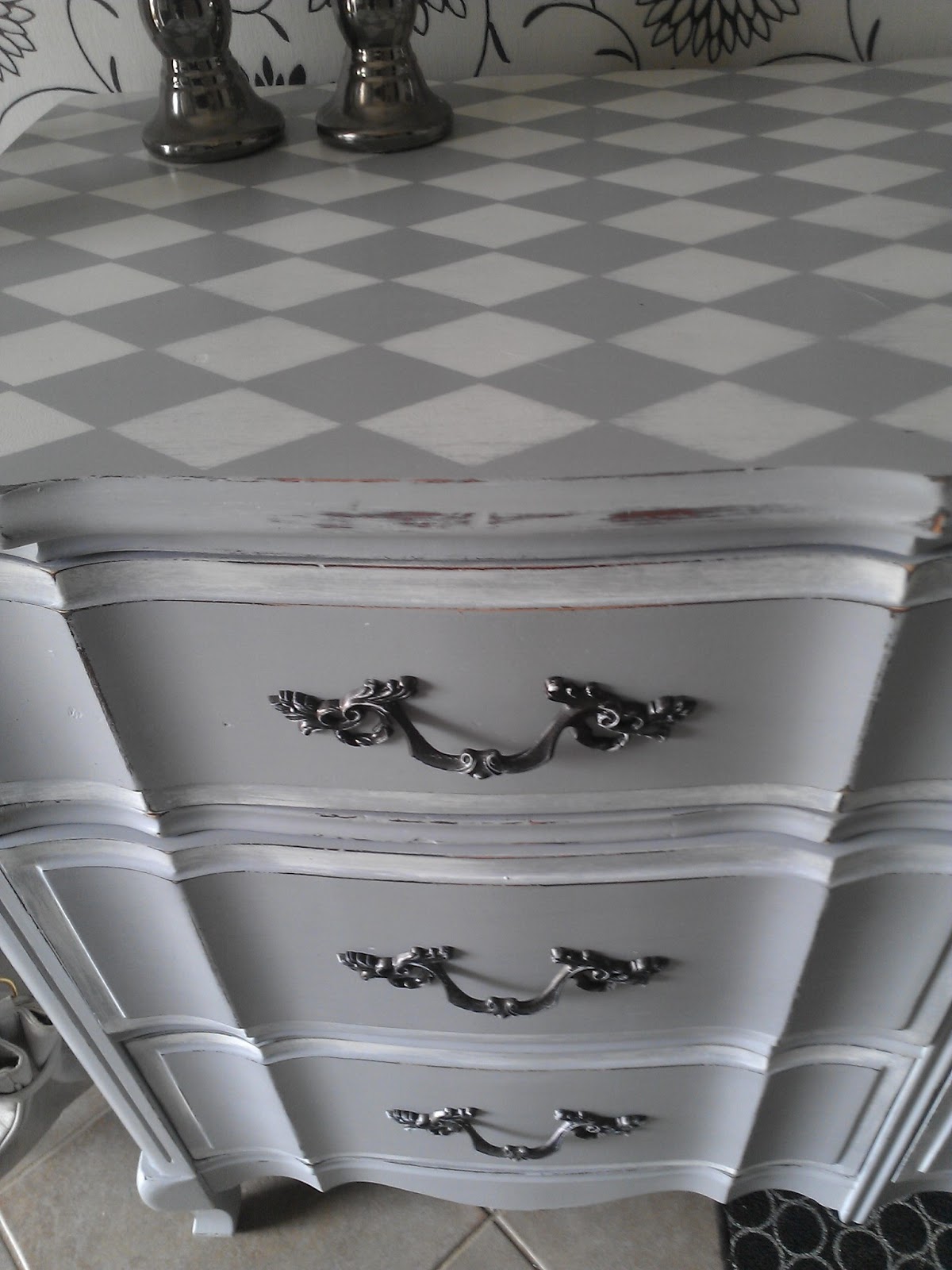
I loved doing this piece.  I had a vision that of a muted grey with a lovely diamond (harlequin) top.  I was inspired to use the diamond top by Crystal at THESHABBIESTCHICK and am so happy with the results.  


It has found its way as a feature piece in an expectant mother's nursery which makes me very happy.


I customed mixed the grey and used white ASCP for the diamonds.  I then gave everything a good distressing and a coat of clear wax.