I picked up this cute little set. I was drawn to the legs. Love em! I think legs are one of the factors that can make or break furniture. And these ones are tall with great lines.
I decided to continue with the gold dipped theme and paint out all three pieces as a set. I wasn't looking forward to taping off the legs and lower frame and trying to get a clean line where the dresser meets the base, so on a hunch I upended the nightstand and saw a bunch of screws. '..It couldn't be that easy..' I thought to myself, but inserted my drill into one of those holes anyhow. A few minutes later I did a little tap dance as I realized that all of the bases detached from the main unit...this translates to 'Super Duper easy to Paint with spray paint!'.
I painted out all of the main units with a cream chalkpaint. I sanded well, cleaned and primed too. I then topped with two coats of chalkpaint. The dressers were already white to begin with, so it didn't take too many coats for good coverage.
I hand waxed and buffed to a soft sheen. I also did a very light distressing on the edges to allow some of the darker wood poke through.
After detaching the bases, I sanded them all well and spraypainted them gold. I also sanded and spray painted the hardware gold as well.
This set didn't take nearly as long as the french buffet I did in my previous post. That is one of the beauties of straight lined furniture and the fast drying powers of chalkpaint!
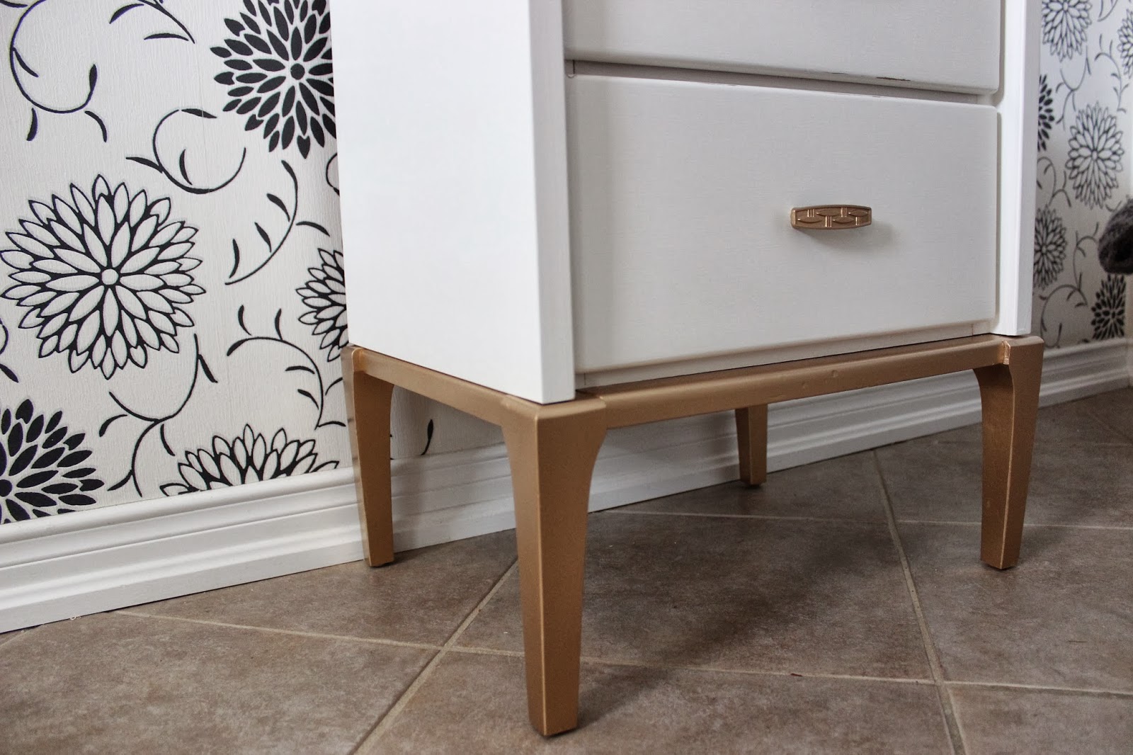
I forgot to take a before picture of this set, but it was a dingy cream and all of the drawers had a blurred line gold trim. My cream and gold looks much better than the original cream and gold!
Showing posts with label 1970s dresser. Show all posts
Wednesday, 12 March 2014
Thursday, 29 August 2013
Aged Light Turquoise
I custom mixed up this colour. It is a nice feminine blue-turquoise. This dresser was in fabulous vintage
condition. A great find with all the
detailing.
I sanded really well, and then primed the entire thing with Zinsser BIN (I find this stuff so frustrating to work with because it dries so bleeping fast, but it has aaaaamazing adhesion)
After my Zinsser dried (about 4 seconds later), wink wink, I painted on two coats of the turquoise. I then highlighted the recessed detail with cobalt blue, and the raised detail with a lighter shade of the turquoise.
The result was very pretty, but not nearly edgy enough, I decided to give everything a really good sand to make it look more ‘antique-chic’ and less ‘little girl’s room’.
Because the Zinsser is stubborn as hell, it doesn’t come away when sanded like the paint does, so its great for creating a layered paint look.
The hardware was very dull and dingy, but I used my old sanding technique to bring out the soft gold lurking beneath. I then shot a blast of sealer to prevent future tarnishing.
I picked up four new rolls of decorative paper a couple of days ago, and it was a real toss up to decide which one to use on the inside drawer facings. I decided to go with a grey/white chevron pattern. I kind of think it gets a bit lost against the boldness of the dresser. I had a great dragonfly on butcher paper one, I wish I’d gone with that one instead! Next time.
And here is the before. Not a bad looking lady.
Linking up to missmustard seed. Have a great long weekend!
Monday, 12 August 2013
Coral Hollywood Regency Dresser
Coral strikes again! Kapow!! I have only been brave enough to try coral once before (here)and I loved it!!! Look all those exclamation marks! Its obvious I love it! Apparently coral was the colour of 2012. So what if Im a year behind. Meh. No biggie
This beauty is a vintage Kroeller dresser and was in ship-shape condition. I used a white primer as I have learned the hard way that coral gets paltry coverage. The lady at the paint store gave a good analogy when she likened it to the coating on a candy apple.
After priming 2 coats, I painted about 3 or 4 coats of the coral. It took quite a lot of coats. I also sealed with two coats of satin wipe-on-poly. I distressed all over the front and sides, but opted to leave the top undistressed. I mixed things up a bit by sometimes distressing through to the wood, and other times going through just to the white primer.
I also discovered by happy accident, that distressing super lightly actually revealed a burnt yellow colour. So all up, there about four different layers of colours on this girl.
I modpodged some leftover coral and white contemporary paper I had from a previous project. I love modpodging paper onto drawers, adds such a bit o’ fun!!
This paper is a medium thickness, and goes on fairly well. I have used it before (here) and really loved how it looked with the coral. I distressed it lightly to take the 'newness' out of it and help blend better with the rest of the piece.
I like chunky hardware, and these ones were super cool. But they were so dark and dirty and dingy looking. I thought about spraypainting gold, but didn’t want them to be perfectly solid. I tried rubbing Brasso over them, but it didn’t work that well, and it really stunk. Im not sure that its related, but I noticed that Miss Do-As-I-Please passed out for about a ½ hour after one good wiff of the stuff. Hmmm, better than catnip?
In the end I tried a trick that worked before (here)by sanding
them. It kind of works like a buffer, and
it shined em up good. I sealed them with
a spray-on acrylic clear coat to help prevent future tarnishing.
***UPDATE
I wasnt quite happy with the hardware, I wanted it a bit bolder, so I decided to add the little backer plates for some extra ooomph! I gave them a blast of gold spray paint as they were not responding to my sanding technique, and then I actually sanded off some of the gold paint randomly to make them look aged.
What do you think? Plates on, or plates off?
Thursday, 8 August 2013
Big Bertha Dressed In Turquoise
I promised a ‘big bertha’, and now I present Big Bertha! My word, this ol girl almost embarrassed herself by not fitting into my Mazda 3 hatchback. I had to give her a subtle lecture about diet and nutrition, because she is... big and chunky! Almost 7 feet long and definitely over 200lbs (sorry Bertha, but disclosing your weight is for your own good). Eat some lettuce.
I clearly love this shade of turquoise/teal, because I have used it a billion times now. I use it so much that my neighbor stopped by for a garage-chat the other day and asked ‘are you still painting that dresser?’ I paused midstroke and threw him a puzzled look before stammering, ‘No, I finished that one months ago, this is different one.’ I was too ashamed to tell him I had done about five other ones in the same colour in between the one he was referring to and this one.
He is also the same neighbor who when I told him I rescued a beautiful credenza that was bound for the dump (this post), asked me if that was the colour I received it in (I had painted it the same shade of turquoise) implying that I hadn’t done anything to it yet! Men. They just don’t appreciate a nice shade of turquoise. I did take a dose of pleasure a week later by complimenting his turquoise shorts and quipping that he matched my furniture. He may or may not have blushed. He may or may not have got my point. But I had a little inward swell of vindication.
But back to Bertha! She was in great shape for such a hefty girl. I custom tinted some primer before covering her up in my favorite colour.
The hardware was beautiful in it’s grandness, but it was very dull and dark, so I blasted her with some gold spray paint to really amp up the contrast with the dresser.
I did some heavy distressing to reveal the lovely dark wood – a little peek-a-boo. I also accented with some light blue piping and a touch of yellow to tie in with the gold.
The cupboard opens up to reveal three more drawers which I finished in a turquoise/navy chevron paper for a pop of fun.
I love big-bertha, but it will take a big room to handle a statuesque woman like her. She is too much women for my little hallway, indeed!
Linking up to party with:
miss mustard seed
Subscribe to:
Posts (Atom)
.jpg)


