Showing posts with label child's room. Show all posts

Saturday, 29 June 2013

Bedset in Coral

I leaped out of my comfort zone with this colour!  I picked up this contemporary bedroom set.  The Longboy and the Armoir were so lovely and en-trend, that they escaped my paint brush altogether.  The nightstands however, were in pretty rough shape.  And the headboard, well, it was kinda bland.


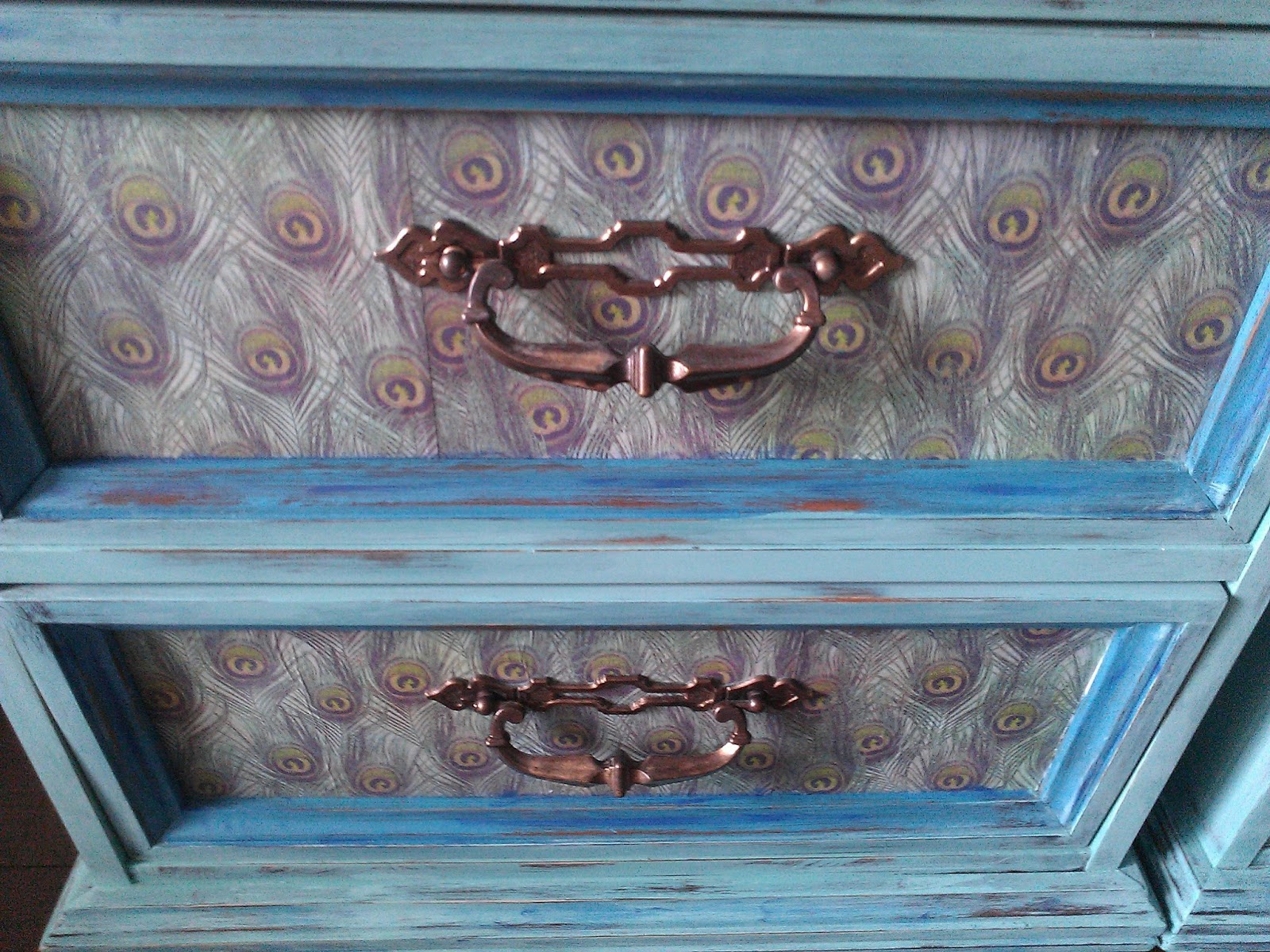
I found this lovely paper a few weeks ago and had a vision to use it on a headboard and nightstands, so when I caught a glimpse of this furniture I decided to put my matchmaking skills to the test.


I thought about painting the furniture gray and having the paper ‘pop’ off, because I think coral goes with gray nicely.  But I have painted things in gray before.  What I haven’t done is paint things in coral!


Everything got a good distressing to ‘age things up’ a bit.


I love the original hardware on these cabinets.  So unique.


I think I will definitely be using coral again.  Very happy with it!


linking up to:


savvysouthernstyle


Monday, 6 May 2013

Triple Dip the MCMD

Ok, if you have seen my earlier posts, you will definitely recognize this look!  I love turquoise, I love two-toned, and I love MCM dressers!  Those three loves saw me create a very similar dresser to one I did before.  


It is actually a different colour than the previous one, but it only by a shade or two.


I decided to keep the original wood pulls, but just paint them out to match the rest of the dresser.  I opted for white so that they would blend it rather than draw too much attention to themselves.


It looked too plain after I painted the front all white, so I added the three racing stripes to give her some more interest.  I affectionately refer to her as 'triple dip'.  Mr. Chuckles thinks its funny that I give all of my pieces names.  I like to assign a personality to them based on their attributes, and it helps keep me organized when I store all my pics in folders under their 'name'.


And here is the before!

Sunday, 5 May 2013

Minty Teal Large Dresser with Peacock Paper

I love how this one turned out.  The pics are not amazing, but in real life she is a great colour and her clear wax has given a lovely soft sheen.  I custom mixed ASCP colours to come up with my various shades of green, mint and teal.  I also accented with some turquoise and blue.  I distressed pretty heavily and lots of the wood shows through.


I originally papered the middle section as well, but I didn't love how it turned out, so I overcame this by lightly painting over the paper and distressing so you can only see it in a subtle way.  A bit like a whitewash.


Thanks again to Dionne at THETURQUOISEIRIS for inspiring me to use the peacock paper. She is amazing!


Mint bedside tables with Peacock paper


I tried a little something different on these cute nightstands by using modpodge to attach some decorative paper to the front.   The paint is a minty custom mixed using Annie Sloan, and I accented with shades of green and turquoise. 


 I clear waxed everything, but left it low lustre by not overbuffing.  The paper matches the mint, and features little peacock feathers (an idea inspired from Dionne over at THETURQUOISEIRIS).


  I think they turned out pretty neat, and they certainly look great on the dark wood floor.


Saturday, 4 May 2013

Bermuda, Bahama, Come On Pretty Mama - MCM again!

Im gonna be blunt here.  Bahama did not live up to her name when I first cast eyes on her.  She was ugly, she stunk like a cheap hooker who smoked too much, and she was scattered in pieces.  Literally. She was on the floor of some guy's garage all shewn about in smelly disarray.


It didn't take me long to figure out why.  Her drawers were a maze, all nine of them.  She was one of those finicky little pieces that was designed in such a way that each drawer only fit into one slot (despite the fact that they all seemed to look the same).  Mr. Chuckles, the owner, and me, all spent about 10 minutes crawling over each other like a bad game of twister trying to fit Bahama's bits back into her chest so we could pack her up in the hatchback.


If I had been handing over money for her, I most likely would have politely said 'no thank you', turned on my heel and quickly scuppered off, but she was a freebie, so I just couldn't say no.  We strapped her into the car and brought her home to my salon for the big makeover.


Having a stamp on her backside that said "Bahama" inspired me to paint her a bright, tropical colour. I settled on a turquoise blue (suprise, suprise!) contrasted with pure white.


I like the way she turned out, for some reason she makes me want to go bowling. She definitely has a 1950s vibe about her.

Friday, 3 May 2013

Stunning Column Dresser

I was lucky enough to find the long dresser and the matching night stands for this.  I painted them in a corresponding fashion using my favorite turquoise with ASCP florence underneath.  


I love how the green peaks out beneath the Blues.  I did a fair bit of distressing on this to let the wood poke through.  I changed out the hardware as one handle was missing off the original and I couldnt find a match.  I like how the gold contrasts so well with the turquoise.


Miss Shabby

I was inspired for this piece by Mak & Jill's website and a piece they called Shabby Shabby.  I named mine Miss Shabby.  She was a curbside find and had a bunch of gunk stuck to the outside of her, but structurally she was pretty good.  


I opted for some heavy distressing to create a really country-rustic feel.  She is two-toned white and turquoise.  


I changed out the hardware, buying these cute vintage pulls.  I did a light dry brushing with white.


I think she looks lovely and is now being used in a young fella's room.  I guess we should call him Mr. Shabby now.